Tuesday, April 19, 2011

art is echoed in the oddest of places!

So one childhood love of mine was the rubiks cube. God knows i never knew how to solve it, the farthest i got was one side (which oddly was always the white side)

anyway below is the rubiks cube..........BUT WAIT!!!!!!! WHATS GOING ON HERE


As you can clearly see, this cube differs from the norm by having an extra plane of cubies that rotate independently from the others. The pleasing aspect of this puzzle, is that when scrambled, it looks like a work of art.

I'm not kidding. Look at the picture. Is it Bauhaus? Suprematism? Cubism?what?


its hard to tell, but i did some snooping and i found a bunch of other rubik cube designs that echo other art styles.
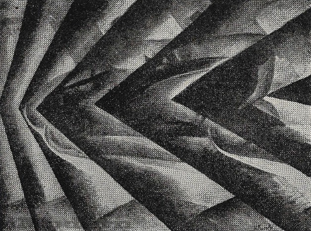
this is like a constructivist one, very angular and 

im going with surrealist on this one, just such an odd shpe and everything


this is an art s and crafts movement, flowery type one, very dark though

this cube is for those who are gaga for transportation signage symbols (hah)

this is futurism in a way, with a machine like, futuristic feel to it

and this would be art nouveau i would say, soft, and smooth, light coloring, and rounded edges


I think these rubiks cube designs (which are fully functional i might add) are a cool, and to see a small correlation between them and different art movements is pretty interesting.

art can be echoed in the weirdest of venues can it not??

Logo a go go

 I saw this website about logos and how the best ones around are the ones that make you take a second look.

if they stick out in your mind, then they have done their job tenfold.


You know some logos are just words, or a simple image, but the ones im gonna show you have a kick to them. they are very clever in not only their craft and design, but in their proposal...sort of, hey look at me, aren't i the most kickass logo ever....and you would say eh!....and the logo then says hey bitch, look at me closely....thats when you realize holy balls!!! what a kick ass logo, i didnt even see the magic the first time.

Its the play between type and imagery, that cause and effect, that makes these little "watermarks" all the more awesome.


 Take a look.....or two!!


Logotype Against Nazism and Racism.  Provocative but awesome!


Logo design for rock band from Vancouver B.C. All the designer did was take all the letters of the word BISON and make them look like a bison body. I like the way how the body details are found within the letters, as tail or horn.

Clever and well made logo, true power of typography.

A combination of the word LocK and Key. Smart logo.

The Mill is a post-production and visual effects company in the UK. If the logo was seen only on its own it would not have the strength.


 the 1stwebdesigner.com site is where i found the stuff

take a look to see more

Monday, April 18, 2011

The Empire Strikes Dali...or should I say Dali strikes the Empire

If you have read my blog, you know that salvador Dali is my favorite artists EVER!!!

well Dali has a tendency to exaggerate the legs of elephants in his pieces.

lemme show you


well some genius has made the AT-AT walkers frm star wars into art that would make Dali proud.


i dont know the artist who made this, but I thought this was cool to share

The Broken

I noticed this today.

as posted before, my favorite band is Coheed and Cambria


and in there new album, the Year of the Black Rainbow, there is a song called the Broken

I was watching the music video for the Borken, and not only is it a masterpiece, but i noticed what a blend of art movements where in this video. It sort of combines futurism with constructivism!


The Futurist style in its regard to machinery, and the quick-pace of the modern lifestyle is very gritty yet solid. Although seemingly sloppy, its very conscious as to its purpose and meaning.

notice the grit, and hard shapes, much like that of a machine

Constructivism refers specifically to a group of artists who sought to move beyond the autonomous art object, extending the formal language of abstract art into practical design work, which led artists to seek to create a new visual environment, embodying the social needs and values of the new Communist order.


notice the striking horizontal composition, with a repetition of daunting shapes (hot air balloons) and dark overlaying colors


Now the music video combines these two, with more of a modern feel of course.

SEE FOR YOURSELF!!


notice how there is a large gritty machine feel, and the daunting horizontal compositions echo the constructivist feel.

UGH JUST AWESOME!!

Sunday, April 17, 2011

The logos for the every man!!

My last post was about business logos. One quick and easy image that can identify an entire business.

now how about logos for everyday life, like transportation.

Major international events, or large areas of human traffic, commissioned graphic designers to create pictographic signage in order to convey directions, purpose, and locations quickly and simply.

due to high costs and efforts it was hard for every single international and domestic facility to make their own symbols, so in 1974, the US department of Transportation, commissioned the American Institute of Graphic Arts, to create a master set of 34 passenger and pedestrian oriented symbols to be used nationwide in transportation facilities.

there were steps.

first compile the symbols already developed for transportation signage from the various nationwide facilities.

for example the air transportation symbols below.


the next step was a committe of 5 graphic designers headed by Thomas H Geisman evaluated each of the designs

step 3 the Dept. of Transportation provided AIGA with the 34 subject areas in which to make symbols for, and one solid design for each area was made.

finally the master set of 34 was redrawn by Roger Cook and Dan Shanosky in order to have all the symbols have an overall harmony of line, shape, and weight. This set was utilized nationwide, and eventually world wide, with some variation. 

here is the master set


These symbols have moved on from transportation areas to everyday areas, like streets and other publics buildings, and with its move slight variation but only slight.

look at these pedestrian crossing signs from around the world


the biggest thing here was that these signs helped bridge the language and cultural gaps between humans by providing easy and universal symbolized instruction that can be understood the world over

sooner or later each human will have a symbol of their own!

Friday, April 15, 2011

It takes a logo to know a logo

By the 1950s, Modernism had shed its roots as an avant-garde artistic movement in Europe to become an international, commercialized movement with adherents in the United States and elsewhere. The visual simplicity and conceptual clarity that were the hallmarks of Modernism as an artistic movement formed a powerful toolset for a new generation of graphic designers whose logos embodied Ludwig Mies van der Rohe’s dictum, "Less is more." Modernist-inspired logos proved successful in the era of mass visual communication ushered in by television, improvements in printing technology, and digital innovations.


The fact of a logo defining a business is a brilliant idea. One discernible recognizable symbol, that can be mass produced that when recognized, it instantly makes the view of the business that its representing. Its essentially a virtual time stamp of sorts.

These logos cross the world over!!

mtv music television

apple computers

batman (i couldn't help myself)

federal express

target stores

puma apparel

mcdonalds fast food

other fast food


Its the better symbols that cross a smart simple image with a subtle surprise in it. A logo that can be printed any size, and the world over

look at how the words burger king act as the hamburger meat in between 2 buns

or the word subway has 2 subway arrows at each end of the word

or dominoes pizza logo is in the shape of a pizza box, and has a domino design

the fedex sign, wich is a mail service, a little arrow forms in between the "E" and the "X"


some are so simple they still work amazingly

the apple logo is a macintosh apple silhouette with a bite out of it

batmans symbol is a black shape of a bat

mcdonalds is just a big gold M

Puma a puma silhouette

and target is just a red and white target

these logos are all over the place, and they work tremendously. As soon as they are seen we instantly know the company, their products, and their message.

its amazing how one small logo can do so much.

a forerunner in this fact is the late great Paul Rand

Paul Rand (born Peretz Rosenbaum, (August 15, 1914 — November 26, 1996) was an American graphic designer, best known for his corporate logo designs, including the logos for IBM, UPS, Enron, Westinghouse, ABC, and Steve Jobs’ NeXT.

here are some of his famous logos

and the man himself

paul_rand


Tuesday, April 12, 2011

Lets harken back

Lets harken back to typography for a second!

comic book typography to be exact.

I love comic books, a lot, i love the artwork, the subject matter, the imagery everything.

all the way up the chain from the pencilers to the inkers to the colorists

writers, producers and the ARTISTS!!!!!!!


however there has always been a dark spot in comic books and thats the typography. As i have learned the past few months typography is a weapon not to be thrown around lightly. When used properly it can kill (and i mean that in a good way) but when tacked on all shotty and half-fast it can get messy.

The years have been ever UN-changing for comic book art and its very sad. Sad enough to break an image or tae away from a beautiful composition.

ComicCraft.com and Blambot.com are two of the major contributors to comic book fonts on the web, but the fonts they offer are all the same. Curvy child-like bubbly font, they all seem to be a variation of "Comic Sans". Its terrible.

but there are those in the midst that break the stride and offer a new perspective on the type used in comic books.

Punks (an online comic book series)


I noticed three different font styles (albeit i dont know what they are)


and theres also the Nightly News (a comic book series featured on ComicBookResources.com)


this is more gritty yet sophisticated right?


these two break the average routine of the overused comic book type and herken in a new format for lettering a comic book

Bravo!!